Power BI - Production Management
💡 Introduction
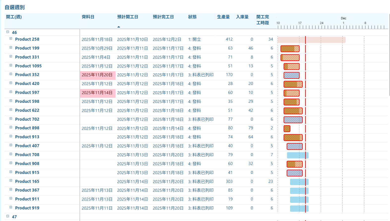
Developed a Power BI dashboard to track and visualize production schedules, progress, and inventory status. The report features a self-created Calendar showing daily production quantities and the duration between production start and end dates, enabling quick identification of bottlenecks or delays.
Two types of Custom Gantt Charts are implemented:
• Bar chart-based Gantt: Uses a padded X-axis to represent days before production starts and production duration, allowing visualization of planned vs. actual timelines.
• SVG-based Gantt in a matrix: Provides flexible, color-coded visualization of production stages and progress for each order.
Key tracked variables include Material Ready Date, Planned Start Date, Planned End Date, Production Quantity, Inventory Quantity, Status (e.g., Created, Released, Bill of Materials Printed, Material Issued, FQC, WIP, In-Stock, Completed). Rows where Material Ready Date > Planned Start Date are highlighted to flag potential delays.
Moreover, Gantt charts and tables allow filtering by stages such as Currently in Production, Planned but Not Started, Expected to Finish but Not Completed, and Custom Week Selection, providing a comprehensive overview of production status, schedule adherence, and inventory flow.
🗝 Keywords: Power BI (Custom Gantt & Calendar Visuals)
📊 Dashboard Showcase
💻 Code Demo
A. SVG-based Gantt in a matrix
1. SVG Gantt Chart DAX Measure
This DAX measure builds a small SVG Gantt chart for each production order in Power BI. It normalizes each order’s start and end dates to a Monday–Sunday calendar, and also aligns the global min/max dates so all orders share the same timeline.
Using this timeline, it calculates pixel positions for the bar start, bar end, and today’s position. The bar is colored by work-order status, and a second bar on top shows completion based on 入庫量 ÷ 生產量.
If the order is overdue and not completed, a red diagonal hatch overlay is drawn. The code also adds weekly dashed gridlines and a vertical red line for today. Finally, all components are combined into a single inline SVG returned as a data URI for Power BI to render.
Gantt_SVG =
--------------------------------------------------------
-- Step 1:把該筆工單換成「週一~週日」區間
--------------------------------------------------------
VAR _start = MIN('查詢'[預計開工日])
VAR _end   = MAX('查詢'[預計完工日])

--------------------------------------------------------
-- Step 2:整體資料的開始與結束,也換成週一~週日
--------------------------------------------------------
VAR _globalMinRaw =
    CALCULATE(
        MIN('查詢'[預計開工日]),
        ALL('查詢'[品名], '查詢'[開工(週)], '查詢'[品名狀態], '查詢'[單據])
    )

VAR _globalMaxRaw =
    CALCULATE(
        MAX('查詢'[預計完工日]),
        ALL('查詢'[品名], '查詢'[開工(週)], '查詢'[品名狀態], '查詢'[單據])
    )

VAR _minDate =
    _globalMinRaw - WEEKDAY(_globalMinRaw, 2) + 1

VAR _maxDate =
    _globalMaxRaw + (7 - WEEKDAY(_globalMaxRaw, 2))

-- NOTE: use +1 to treat the interval as inclusive of the last day
VAR _totalDays = MAX(1, (_maxDate - _minDate) + 1)

--------------------------------------------------------
-- Step 3:SVG 基本設定
--------------------------------------------------------
VAR _w = 350
VAR _h = 25
VAR _leftPadding = 5
VAR _rightPadding = 5
VAR _usableWidth = _w - _leftPadding - _rightPadding

--------------------------------------------------------
-- Step 4:X 座標主計算
--------------------------------------------------------
VAR _xStart =
    _leftPadding +
    _usableWidth * DIVIDE(_start - _minDate, _totalDays)

VAR _xEnd =
    _leftPadding +
    _usableWidth * DIVIDE(_end - _minDate, _totalDays)

--------------------------------------------------------
-- Step 5:bar 寬度(保證至少 0.5)
--------------------------------------------------------
VAR _barWidth = MAX(0.5, _xEnd - _xStart)

--------------------------------------------------------
-- Step 6:完成比例
--------------------------------------------------------
VAR _production = SUM('查詢'[生產量])
VAR _stockin    = SUM('查詢'[入庫量])
VAR _pct = DIVIDE(_stockin, _production)
VAR _pctWidth = _barWidth * _pct

--------------------------------------------------------
-- Step 7:工單狀態顏色
--------------------------------------------------------
VAR _isDetailLevel = ISINSCOPE('查詢'[品名])
VAR _status = SELECTEDVALUE('查詢'[工單狀態])

VAR _colorDetail =
    SWITCH(
        TRUE(),
        _status = "1", "#E7C1BC",
        _status = "2", "#B6E2FE",
        _status = "3", "#44B3E1",
        _status = "4", "#BDA048",
        _status = "5", "#B5E6A2",
        _status = "6", "#B5E6A2",
        _status = "7", "#00B050",
        _status = "8", "#275317"
    )

VAR _useColor =
    IF(_isDetailLevel, _colorDetail, "#FFC107")

--------------------------------------------------------
-- Step 8:延遲判斷
--------------------------------------------------------
VAR _isDelayed =
    IF(
        _end < TODAY() &&
        _status <> "8",
        TRUE(),
        FALSE()
    )

--------------------------------------------------------
-- Step 9:Today 位置
--------------------------------------------------------
VAR _todayPos =
    _leftPadding +
    _usableWidth * DIVIDE(TODAY() - _minDate, _totalDays)

--------------------------------------------------------
-- Step 10:Weekly 虛線(星期一)
--------------------------------------------------------
VAR _mondays =
    FILTER(
        ADDCOLUMNS(
            CALENDAR(_minDate, _maxDate),
            "IsMon", WEEKDAY([Date], 2) = 1
        ),
        [IsMon] = TRUE()
    )

VAR _weekLines =
    CONCATENATEX(
        _mondays,
        VAR _d = [Date]
        VAR _x = _leftPadding + _usableWidth * DIVIDE(_d - _minDate, _totalDays)
        RETURN
            "<line x1='" & _x & "' y1='0' x2='" & _x & "' y2='" & _h &
            "' stroke='#808080' stroke-width='0.8' stroke-dasharray='3 3' />"
    )

--------------------------------------------------------
-- Step 11:SVG 組裝
--------------------------------------------------------
VAR _svg =
"
<svg xmlns='http://www.w3.org/2000/svg' width='" & _w & "' height='" & _h & "'>

    " & _weekLines & "

    <rect
        x='" & _xStart & "'
        y='2'
        width='" & _barWidth & "'
        height='20'
        fill='" & _useColor & "'
        fill-opacity='0.5'
        rx='3'
    />

    <rect
        x='" & _xStart & "'
        y='2'
        width='" & _pctWidth & "'
        height='20'
        fill='" & _useColor & "'
        fill-opacity='1'
        rx='3'
    />

    <defs>
        <pattern id='diagonalHatch'
            patternUnits='userSpaceOnUse'
            width='6' height='6'>
            <path d='M-1,1 l2,-2 M0,6 l6,-6 M5,7 l2,-2'
                stroke='red'
                stroke-width='1'
                stroke-opacity='0.5'/>
        </pattern>
    </defs>

    " &
    IF(
        _isDelayed,
        "<rect
            x='" & _xStart & "'
            y='2'
            width='" & _barWidth & "'
            height='20'
            fill='url(#diagonalHatch)'
            stroke='red'
            stroke-width='1.8'
            rx='3'
        />",
        ""
    ) & "

    <line
        x1='" & _todayPos & "'
        y1='0'
        x2='" & _todayPos & "'
        y2='" & _h & "'
        stroke='red'
        stroke-width='2'
    />

</svg>
"

RETURN "data:image/svg+xml;utf8," & _svg
2. Timeline SVG DAX Measure
This DAX measure creates a horizontal timeline SVG used as the shared axis for the combined Gantt chart.
It first identifies the global minimum and maximum dates across all work orders and expands them to full Monday–Sunday weeks.
Then it calculates the total number of days and maps each calendar date to an X-position in the SVG.
The code draws vertical tick marks for every day, labels each Monday with its day number, and adds monthly labels positioned at the start of each month.
Finally, it outputs a light-blue background with day ticks, Monday labels, and month headers—forming a clean timeline bar that aligns with the main Gantt chart bars.
Gantt_Timeline_SVG =
VAR _globalMin =
    MIN('查詢'[預計開工日])
VAR _globalMax =
    MAX('查詢'[預計完工日])

-- Full week alignment
VAR _globalMinWeekStart = _globalMin - WEEKDAY(_globalMin, 2) + 1
VAR _globalMaxWeekEnd   = _globalMax + (7 - WEEKDAY(_globalMax, 2))

VAR _totalDays = MAX(1, _globalMaxWeekEnd - _globalMinWeekStart)

--------------------------------------------------------
-- SVG Layout
--------------------------------------------------------
VAR _w = 344
VAR _h = 50
VAR _leftPadding = 5
VAR _rightPadding = 5
VAR _usableWidth = _w - _leftPadding - _rightPadding

--------------------------------------------------------
-- Calendar with X positions
--------------------------------------------------------
VAR _calendar =
    ADDCOLUMNS(
        CALENDAR(_globalMinWeekStart, _globalMaxWeekEnd),
        "XPos",
            _leftPadding +
            _usableWidth * DIVIDE([Date] - _globalMinWeekStart, _totalDays),
        "DayNum", DAY([Date])
    )

--------------------------------------------------------
-- Tick marks
--------------------------------------------------------
VAR _dateRects =
    CONCATENATEX(
        _calendar,
        "<line x1='" & [XPos] &
        "' y1='40' x2='" & [XPos] &
        "' y2='60' stroke='#1F5E8A' stroke-width='1.5' />",
        ""
    )

--------------------------------------------------------
-- Show date every 5 days
--------------------------------------------------------
VAR _dateLabels =
    CONCATENATEX(
        --FILTER(_calendar, MOD([DayNum], 5) = 1),
        FILTER(_calendar, FORMAT([Date], "ddd") = "Mon"),
        "<text x='" & [XPos] &
        "' y='35' font-size='10' fill='#1F5E8A' text-anchor='middle'>" &
        [DayNum] & "</text>",
        ""
    )

--------------------------------------------------------
-- Months
--------------------------------------------------------
VAR _monthList =
    DISTINCT(
        SELECTCOLUMNS(
            _calendar,
            "MonthStart", DATE(YEAR([Date]), MONTH([Date]), 1)
        )
    )

VAR _months =
    ADDCOLUMNS(
        _monthList,
        "XPos",
            _leftPadding +
            _usableWidth * DIVIDE([MonthStart] - _globalMinWeekStart, _totalDays)
    )

VAR _monthLabels =
    CONCATENATEX(
        _months,
        "<text x='" & [XPos] &
        "' y='20' font-size='12' fill='#1F5E8A' text-anchor='middle'>" &
        FORMAT([MonthStart], "MMM") & "</text>",
        ""
    )

--------------------------------------------------------
-- SVG output
--------------------------------------------------------
RETURN
"
<svg xmlns='http://www.w3.org/2000/svg' width='" & _w & "' height='" & _h & "'>

    <rect x='0' y='0' width='" & _w & "' height='" & _h & "' fill='#eff9ff' />

    " & _dateRects & "
    " & _dateLabels & "
    " & _monthLabels & "

</svg>
"
In combination of the above two measures, we get: